I don’t know about you (the four or five people who are following this blog) but I feel really, really great about the election outcome.

And, I’m glad it’s all over too. What a long year of campaigning its been but I have to say, it was all worth it in the end because it feels good when things go the way you want them to.
So, since I’ve been writing this blog, I’ve noticed a change in my habits. Instead of taking pictures of every house I see, I’ve become much more selective. I’m attributing this change to the fact that I’ve taken a ton of pictures of my neighborhood and since I live car-free, I tend to be in my neighborhood a lot.
Today I want to share with you some houses that have gone beyond the bold and the pastel to a new, daring place where color sets its own rules. A place that knows know bounds, a place I would like to visit more often, a place I call, PushTown!
Yeah, PushTown, where paint is more than just a color, its a statement of freedom of creativity, a celebration of what a gallon can do in the right hands.
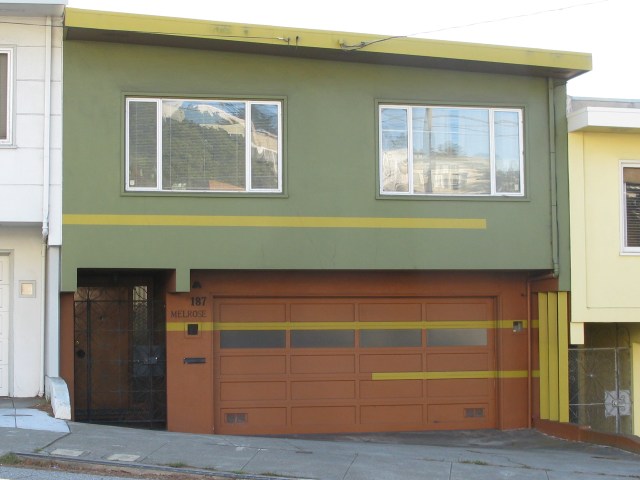
Now I grant you, this isn’t for everyone, for sure but, it does show us the possibilities thinking out of the box can take you and I love it. The color choices aren’t my favorite but it works. It’s simple and bold, tasteful, coordinated and unique. The patter seems at first random and maybe because the horizontal lines aren’t all the same thickness, which I think is a mistake, however, it plays well with the three vertical lines on the right, something I failed to notice when I took this picture. I also really like how the owners decided to continue the long, horizontal line all the way across the width of the garage and the house, including the utility window, effectively underlining an otherwise unremarkable house address. All told, I give this paint job: !!!! (my new rating system).
Next:
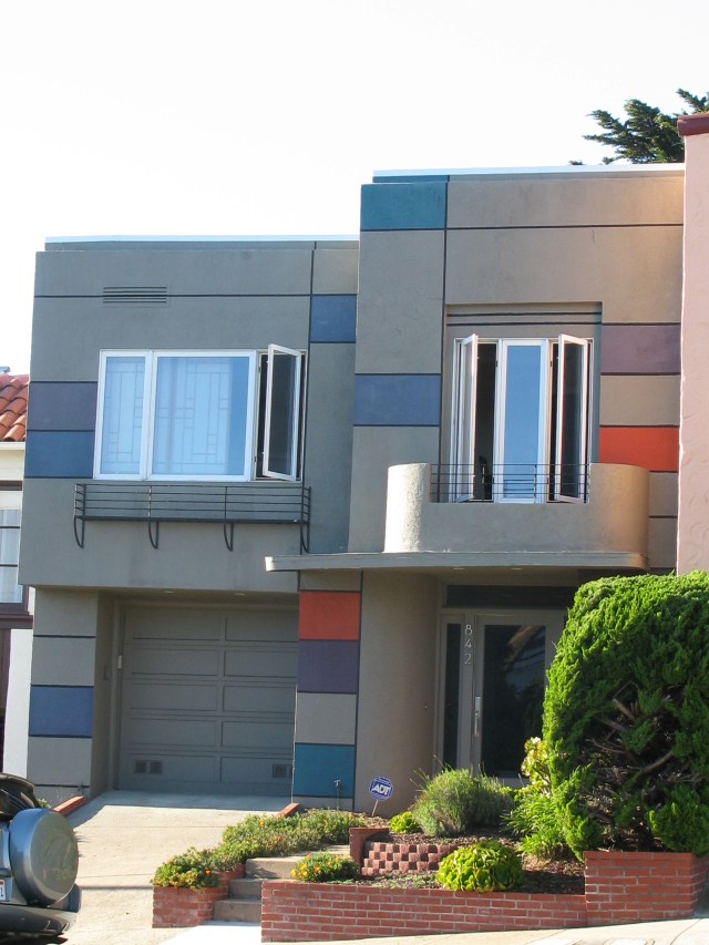
Again, I’m not loving the color choices here but I can’t help but give thanks to the owners for pushing the envelope. I also happen to be a huge fan of the Dutch painter, Piet Mondrian. In fact, when I was a graphic designer, I used to create all my work with his paintings in mind. So naturally, I would love this design which, intentionally or not, gives a nod to the innovative way of breaking up space that Mondrian so effectively showed the world in his painting. Again, the design is bold without being obnoxious. It invites inspection without asking for ridicule. It pushes the envelope in a direction I want to follow so I’m giving this house a !!!!
That’s all the examples I have to share with you today. I hope you are enjoying my posts. I apologize for missing the past couple of days. Creating this blog is a lot of fun for me and I love to write and take pictures but it is time consuming and some days, I just don’t have the time. Thank you for hanging with me. Until tomorrow (or the day after that), I remain,
your design detective,
Karen


